Bayer PLUS Rewards:
Taming Complexity
Bayer PLUS Rewards provides cash-back rewards for over 50,000 farmers who have linked their purchase data of seeds and crop protection products to the program. With rewards often reaching over tens of thousands of dollars per user, continual support of their experience within this complex program was paramount.
the CHALLENGES
Users are encouraged to contact Bayer Support whenever they need assistance with the rewards program. I analyzed the support team data, identifying specific barriers and disruptions in the user experience.
the SOLUTIONS
With my background in visual design and writing, I provided end-to-end creative solutions from user flows to final asset delivery.
the PROCESS
These are a few examples of the ongoing UX support I provided for Bayer PLUS Rewards.
IMPROVEMENTS IN REGISTRATION
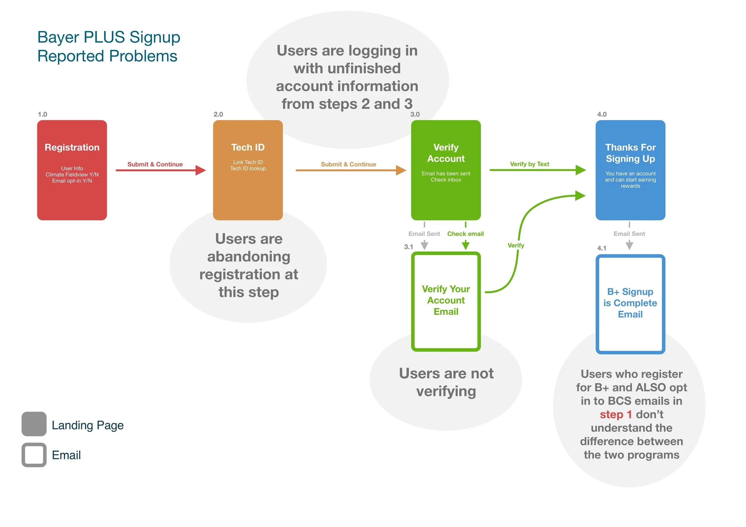
Website traffic and support call data highlighted a variety of problems with the registration experience of Bayer PLUS. Incomplete registrations resulted in user confusion about whether they had successfully signed up for the program.
I created a user flow for the signup process, noting the problem areas and how my proposed solutions would integrate into the existing experience. My solutions included copy updates to help with clarification, a new page within the registration experience, and automatic emails to remind users that their signup is incomplete.
DATA VISUALIZATION FOR SMALL SCREENS
Before my team was onboarded to Bayer PLUS, it had been initially designed to be a desktop-first experience. With mobile being lower priority during phased updates, some sections of the experience had become practically unusable on mobile. I performed a UX audit and collaborated with the development team to make key updates in purchase data visualization.
REWARDS VISUALIZATION
Bayer PLUS Rewards allows users early access to a portion of their rewards, while confirmation of purchases are processed on the back end. This phased system of allowance was unclear to users at a glance. Panicked support calls poured in, with users seeing thousands of dollars in their Total Rewards Balance but unable to access all their rewards.
I proposed two integrated solutions: updating the terminology surrounding rewards and balances, and designing an at-a-glance “rewards breakdown” visual.
After this update was implemented, the panicked calls stopped as users understood their rewards balance and could visualize what cash would be available when.
Before. ”Where is the rest of my $40,000??”
After. Showing what’s been redeemed and what’s coming soon.
MIGRATION
Bayer PLUS Rewards initially existed as a portion of the larger website Bayer Crop Science. When Bayer PLUS moved to its own standalone site, it was an opportunity to optimize the information architecture and user flow.
I developed sitemaps, designed the new navigation, and enhanced the user experience within the account management section of the site.
Bayer PLUS Rewards experienced a successful migration to its own ecosystem at www.mybayerplus.com with no increase in customer support calls in the months after.
the RESULTS
Each unique user experience optimization project for Bayer PLUS resulted in a marked reduction of support requests for the issue being addressed. While specific success metrics regarding customer service calls are kept confidential by Bayer, it's clear that I made a substantial positive impact on the overall user experience of Bayer PLUS Rewards.


